PAGES
▼
Wednesday, January 29, 2014
Monday, January 27, 2014
Wednesday, January 22, 2014
The twins second nursery...
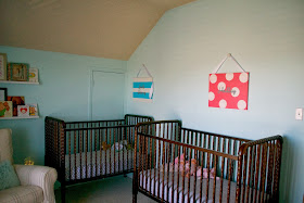
This room came with MANY challenges and in the end, I don't love it but this is a very temporary space. The challenge of creating a boy/girl nursery was a big one. It was hard in Cincinnati where we brought them home but it was really hard to make a room for 9 month olds... not really newborns but not really toddlers. I wanted to go SUPER girly or SUPER masculine with a nursery but to have a shared space, you cant really do either, so then you just feel stuck. If newborns, I could have gone more elaborate since they are tiny babies who are so angelic it wouldn't really matter if you went to feminine but lets face it, Jack Henry is playing with cars and trucks now, it just felt wrong to be too frilly. Their first nursery was gray so I didn't want to repeat so we decided to go aqua and gray. The plan is to keep them in this room until they are in their big boy/ big girl beds. When that will be, I'm not sure. Part of me wants them to room together forever. They have so much fun together in their room and they have always been together. The thought of separating them makes me very emotional but when we have our next baby, they will need that nursery, so until then we will keep these sweeties together. My thought is we will probably give them their own big boy and big girl rooms when the next baby comes and then room that baby with whichever gender matches one of the twins when it is time.
The popcorn ceilings need a serious scraping and need to be painted a fresh white (we'll probably do this before future baby number three) and the cribs really needed to be painted white for this space but If we have a boy in the future, I am not sure if I want to commit to that. Thats the theme of this nursery, un-sure and compromising. But it's okay, its still a sweet little space where my babies get to spend lots of their life.
This room was an AKWARD layout. One wall has the closet door, as well as random drawers built into the wall. Another wall is taken up mostly by a window, while another wall has an attic door on it (we just painted it the same color as the wall to make it blend in more (pretending it wasn't really there) and the only wall that is free space, is the wall the your back it to when you walk in, making a focal space. It was such a challenge, and adding not one but two cribs to the mix and an oversized chair made this a challenge that kept dragging out until finally, I had to accept that it was what it was and I didn't want to put a lot of money into it since they won't be in there long. The cute numbers and bedskirts are now gone as the cribs are in the lowest positions. The room needs a rug badly but again, I want to spend money on rugs that will work with the next baby, or in their future rooms, and I just didn't find anything that I was happy with to commit and make that happen. It's a cute little space but I am really looking forward to not making a unisex space :)
There is a play room right off of the babies room (perspective shown here)
Wall color: Barely Teal by Benjamin Moore
Curtains: Pottery Barn Kids
Glider: Pottery Barn Kids
Changing table: Craigslist
Cribs: Jenny Lind
Shelves: Ikea
Chandelier: Ballard Design Outlet
Side table: Used to be my great grandmothers (painted)
Canvases from a dear friend/family
Clock: used to be my niece's. Babies R us
In search of a lamp for the side table and a rug.


